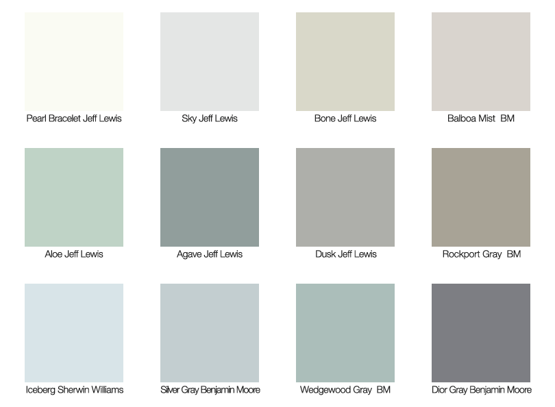
When decorating a small home a really common bit of design advice includes decorating with neutrals in order to keep the space looking larger visually. While you gotta love what neutrals can do for a small room, they can get a little boring, especially if your idea of neutrals means beige, beige and more beige. In the last few years, designers have opened the way for a more adventurous use of the “new neutrals”. In fact, Benjamin Moore Paints has a whole new line called, The New Neutrals… and it’s far from boring! These colors include toned down versions of greys, plums, greens, golds and blues. They read as neutral as a pair of denim jeans, but creates a look far more interesting. The new Jeff Lewis Color line from Dunn-Edwards is a great choice as well…Here are some examples of the “new neutrals” and how they can be used in a small space. Put away the beige! The featured photo below shows you our picks for some of the best “new neutral colors” for today!
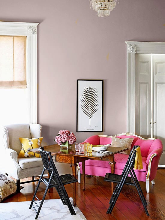
Purple can be a fantastic neutral for a room that is full of life and energy. It still fades into the background, but with some ooomph!
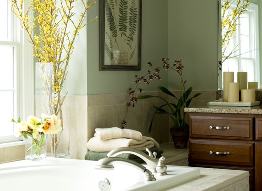
Greens are tranquil colors that blend with most accents. Use a grayed down version for the most neutral effect.
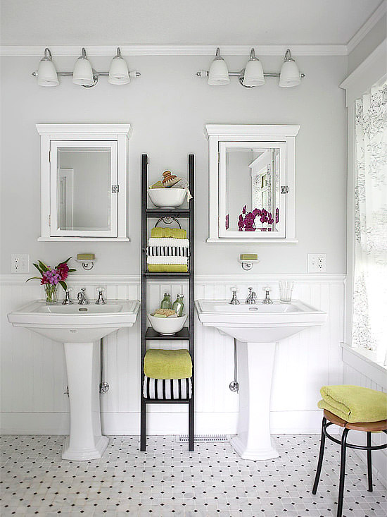
Greys are my favorite neutral, and they can be found in both warm and cool hues.
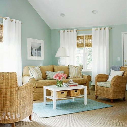
This neutral blue living room gives you a calming feeling without being cold.
Use the new neutral to create a more interesting design scheme in your small home, without overwhelming it with bright colors!
Image Credits: Benjamin Moore

i came across a circular crocheted rug on another website(https://www.upliftpo.st/13-diy-apartment-decorating-hacks-that-will-look-like-you-hired-a-professional-12-what-a-transformation/) (#2 gives 4 rug pictures) that attributes the rug to Decorating Your Small Space. I have searched your website and found the other 3 rugs, but cannot find the neutral circular rug. Can you tell me where to find it?
Author
I wish we could help Kathy… Not only has that site populated their whole post from images on our site against our copyright policy, they haven’t even attributed them to the right pages! Also, that rug you referred to is not actually on our site, so Im afraid I can’t help you with where it came from… Im glad you brought it to our attention though! Thank you, and good luck finding it!
I recently did a make over in my kitchen and researching paint colors and getting reviews being in a small place that is some what dark in the kitchen I figured go bright and cheerful I love the wall color sage by glidden and celery root by valsper like both the celery root is just a pinch of green looks to me like stone the big mistake I think I made was trim,ceiling Alabaster by Ben Moore which I thought would be warm but not realizing I picked the wrong one it was suppose to be Sherman Williams Alabaster I’m really would like some advice to pull off the soft sage paint color thanks
We have a small bathroom that needs updating. I plan on painting the ceiling white and the lower part of the room with white beadboard. In a small bathroom…..small space between indentations or larger area between the indentations. I hope to find a tone of blue for painting the top over the beadboard. I saw a beautiful tone of blue which seemed to have a tiny cast of lavender or purple. Might that describe perriwinkle?
Suggestions please sons room in grays
What are the gold colours like? I am looking for an ice yellow.
Can you please tell me what color this first room you referred to as neutral purple?
I been looking for a color just like this!!
Thanks
Author
We don’t have that info, but neutral purples tend to have some gray in them, and any paint store should be able to help you color match!