
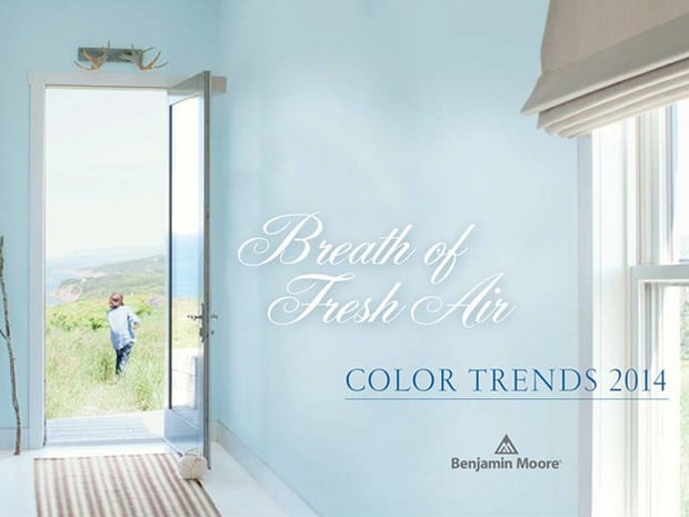
We all know that blues as a palette for a room design is not a new concept. It is, however, one of the most popular and trendy color palettes this year. In fact, Benjamin Moore’s 2014 color of the year is “Breath of Fresh Air”, a soft, ethereal blue that makes you feel just like that! I think that is one of the reasons the blues and grays have become so popular…they make us feel calm, relaxed and yet have an upscale but natural feel. So if you love blue, but are having trouble choosing a palette for your entire room, use these designer options to help you put together everything from wall color to accents.
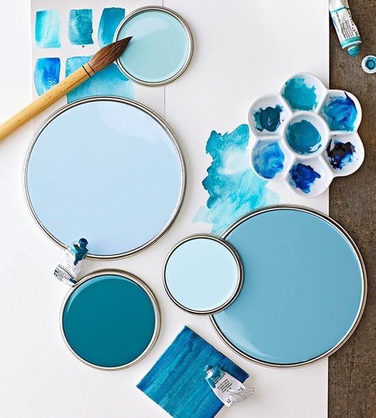
Watercolor blues – Bolder and more for the color hungry, to me these speak of water and sky the most. Get paint colors here.
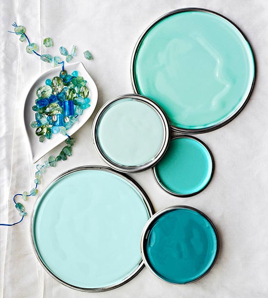
Aquamarine blues are my favorite now – they have a feeling of the sea and sky, but I feel are more neutral because of the green/blue mix. And they are a happy color! Get these paint colors.
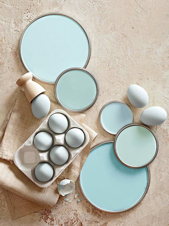
Eggshell, or robins egg blue is a great choice if you’re a little color shy. It’s subtle enough, yet still gives that calming glow of a really fresh color. Get these paint colors.
Sherwin William’s has this incredible new service called “Chip It“. Basically, you upload any photo, and it gives you Sherwin Williams paint color chips to match the pic! Try this, all you have to do is find an inspirational photo with colors you love, they do all the work choosing the colors that match. Here are some examples of blue palettes from the Chip It program.
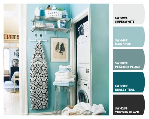
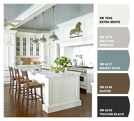
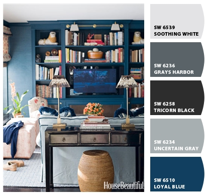
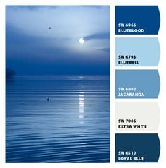
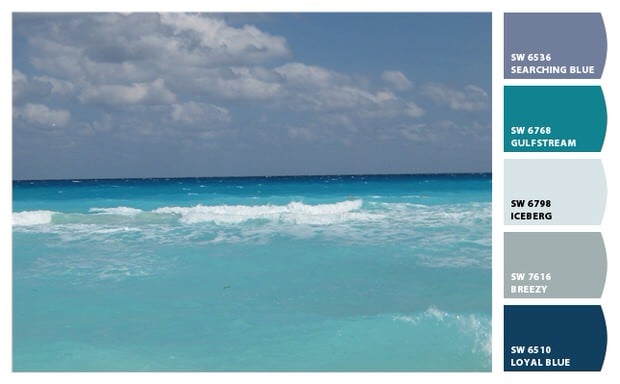
So if blue is your thing, use these color palettes to get you started visualizing your next decorating project, and give “Chip It” a try. Obviously it can be a photo of anything. This is great way to learn how to convey a feeling in a room with color. Most of us know how a photo makes us feel…find a photo that represents the feeling you want in your room, and translate it into paint chips!
Image Credits: BHG, Benjamin Moore
